|
Working with massive datasets presents some unexpected problems. Among those is the need to generate empirical datasets with a clear hypothesis in mind, one that comes with a set of predictions that can be tested in the data. Without a clear hypothesis and with a dataset the size of those generated in mRNA-seq experiments for example, one can explore the data in a matter eventually akin to p-hacking: with 30,000 (or 50,000, etc.) datapoints, many persuasive, and misleading, conclusions can be drawn.
With mRNA-seq data, our readout is differential expression of genes (or transcripts, or non-coding RNA, etc.). As a first pass at analyzing a new dataset, one of the most popular current approaches is to place our data on a 'volcano plot'. These plots are so-named because of how they look- essentially like a volcano of blank space, spewing forth data. Each data point corresponds to a single measurement, plotted with its p-value (y-axis) and its fold-change between experimental conditions (x-axis). The value in these plots come from their organization: data with higher (ie less-significant) p-values or smaller fold-changes are clustered together at the mouth of the volcano. This means that as p-values decrease and the amplitude of fold-changes increases, data are more spread out, allowing an opportunity for labeling of a small number of relevant data points. Below is a simple example using R, in which I have generated a volcano plot with the hypothesis that specific types of immune molecules such as cytokines are differentially-expressed between conditions. As is clear from the data, not only are these molecules differentially-expressed, but these changes are among the most significant from the full dataset: 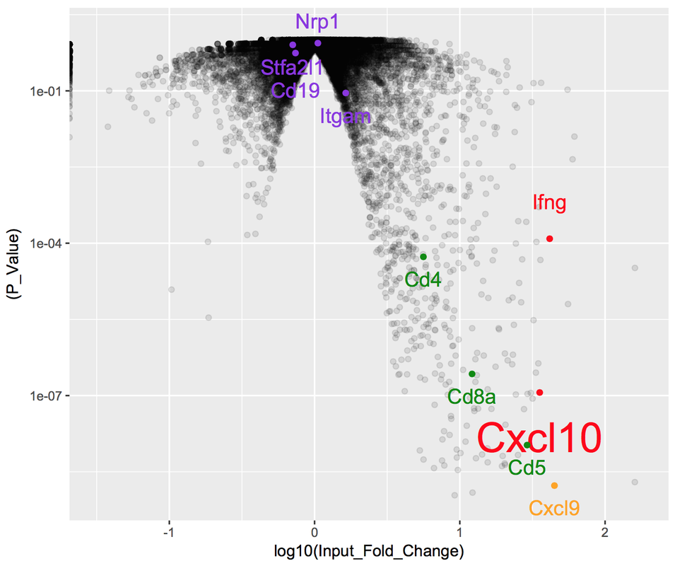
|
 RSS Feed
Proudly powered by Weebly