|
In a previous post, I used data from a phosphorylated ribosome capture experiment to look at the 'activity' of the olfactory receptor gene family. Looking at all of the data arrayed according to gene name was not especially informative however. In this post, I will use this same data to generate a qqplot, which compares the distribution of our datapoints with a randomly-generated normal distribution.
The most exciting thing about this data is not that it gives us insight into which specific sets of olfactory receptors were activated (it doesn't). What's more interesting is that if we generate a qqplot from data collected from animals that were presented a stimulus, we find variability in both directions. [As a side bar, using a qqplot requires some assumptions that are not met in the plus-stimulus condition, but nonetheless this is a useful tool to assess the shapes of our distributions]. Olfactory receptors are typically thought to be 'activated' by odorants, such that they have a basal, inactive state and an induced active state. In contrast, some other receptors similar to olfactory receptors, such as opsins, are active in the basal state and inactive upon stimulation. What jumps out from the data below is that this model for olfactory receptor activation potentially needs to be updated. While many datapoints are greater than the confidence interval band of the qqplot upon stimulation (top right), just as many or more points are less than the confidence interval band (bottom left). These data suggest that the stimulus I am using in this experiment activates some set of olfactory receptors and suppresses the activity of others. The code is below. This uses the same input dataset as in the first olfactory receptor activity post: 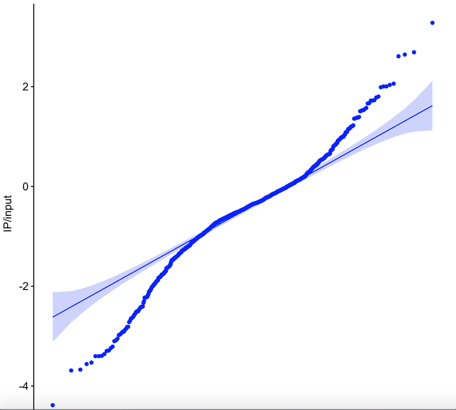
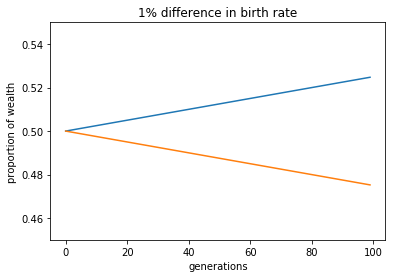
During dinner tonight, there was a small argument over whether, all things equal, differences in birth rates result in increases in wealth disparity. In other words, if population A and B begin with equal proportions of wealth and that wealth is passed down to descendants directly, and if these populations have different birth rates, how quickly does per-capita wealth increase or decrease? This presented an opportunity to do some simple python wrangling. To start, I just modeled the problem by asking, if Japan and the rest of the world started with equal shares of wealth, how quickly would the per-capita wealth change. Japan of course has a negative growth rate, making it a good place to start, but there are endless improvements and permutations. In any case, it helped to settle the argument..
The largest gene families known in nature are those encoding the olfactory receptors. Each olfactory neuron in the olfactory epithelium expresses a single olfactory receptor gene from a gene family of ~1100 (if, in this case, the 'you' is a mouse). Thus, whereas you have three different color photoreceptors to segregate visual information into red, green, and blue at the point of detection, olfactory information is initially segregated into ~1100 channels.
A recent technical advance, termed 'phosphorylated ribosome capture', has allowed for the biochemical purification of mRNA from neurons that have been repeatedly activated. This approach is invaluable for stimulus mapping, which remains a difficult problem in neuroscience. These posts will detail how I have used this approach to measure the activity of the ~1100 types of olfactory neurons simultaneously, in response to stimulus presentation. A fair way to think about this is as an 'olfactory snapshot'. For more information on this approach, see the Knight lab, who developed the approach, or the Matsunami lab, who first applied it to map odorant ligands to olfactory receptors. To control for the variability in expression levels of olfactory receptors, this data is generally viewed in terms of normalized enrichment. Our enriched dataset is generated by purifying mRNA from activated neurons, while our input dataset is generated from the whole tissue. Enrichment for a receptor indicates the probability that a given cell expressing that receptor has been activated by our stimulus. Thus, if our biochemical purification sample yields 10 reads of receptor A and 5 of receptor B, but our total sample (ie input) contains 5 reads of receptor A and 10 of receptor B, the enrichment value for receptor A is 2, and for receptor B is 0.5. The probability that a given receptor A is activated in this condition is therefore 4x greater than the probability for receptor B. In the data given below, I'm making a first pass at asking whether, as a family, olfactory receptor activity is modified between two conditions. To do this, I simply read in the data, normalize it, and plot all data in a linear fashion (in this situation, receptors are simply ordered according to gene name). What immediately jumps out is that the spread of the data is different between the conditions- in other words, one condition is 'noisier' than the other in terms of olfactory receptor activity: 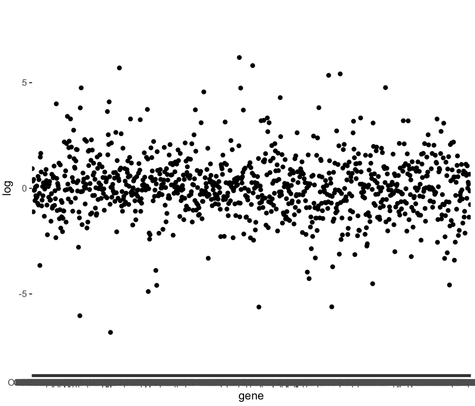
Working with massive datasets presents some unexpected problems. Among those is the need to generate empirical datasets with a clear hypothesis in mind, one that comes with a set of predictions that can be tested in the data. Without a clear hypothesis and with a dataset the size of those generated in mRNA-seq experiments for example, one can explore the data in a matter eventually akin to p-hacking: with 30,000 (or 50,000, etc.) datapoints, many persuasive, and misleading, conclusions can be drawn.
With mRNA-seq data, our readout is differential expression of genes (or transcripts, or non-coding RNA, etc.). As a first pass at analyzing a new dataset, one of the most popular current approaches is to place our data on a 'volcano plot'. These plots are so-named because of how they look- essentially like a volcano of blank space, spewing forth data. Each data point corresponds to a single measurement, plotted with its p-value (y-axis) and its fold-change between experimental conditions (x-axis). The value in these plots come from their organization: data with higher (ie less-significant) p-values or smaller fold-changes are clustered together at the mouth of the volcano. This means that as p-values decrease and the amplitude of fold-changes increases, data are more spread out, allowing an opportunity for labeling of a small number of relevant data points. Below is a simple example using R, in which I have generated a volcano plot with the hypothesis that specific types of immune molecules such as cytokines are differentially-expressed between conditions. As is clear from the data, not only are these molecules differentially-expressed, but these changes are among the most significant from the full dataset: 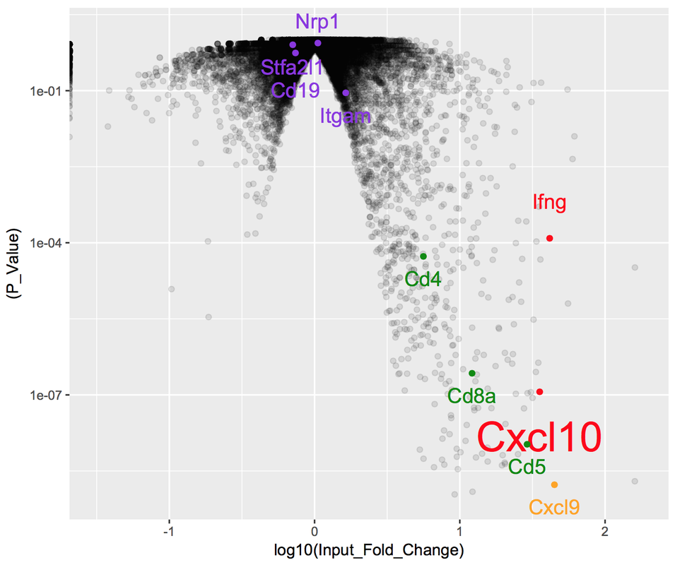
|
 RSS Feed
Proudly powered by Weebly