|
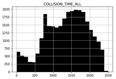
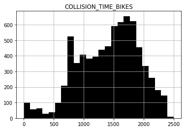
Following up on my post yesterday, I've continued to dig into the statistics on traffic safety in the city of Los Angeles, with a particular emphasis on safety for pedestrians and cyclists. As I noted yesterday, this seems pretty urgent: half of the people killed on Los Angeles streets by vehicles are not driving one at the time. Those numbers stand to get worse, as environmental movements and changing urban realities move more people out of cars. Don't take my word for it: last year there were 21 cyclists killed on the roads in LA County, tying 2016 as the deadliest year on record. As of today, there have been 17 cyclists killed in LA County in 2019, and we've still got four months to go. There is plenty of debate around how best to address road safety in LA. But what is clear is that if the city wishes to prioritize safety and access above speed, it makes sense to identify places--intersections, corridors, times of day, etc.--where serious injury and death are more likely. To that end, I've put together a bit of code to explore data on bike accidents, car accidents, and the places where they happen. The attached images are from a jupyter notebook, developed in python and with use of numpy, pandas, and the google maps API. The raw data is from 2015 through 2018 and is drawn from UC Berkeley's excellent Transportation Injury Mapping System. To get started, here are some histograms on the time at which motorist (left) versus bicyclist (right) collisions are taking place. The similar shape between these two histograms suggests that people are using their bikes in the same way people are using cars. This is why you see peaks around rush hour. [[Incidentally, on my ride today a motorist asked me to get out of their way so they could 'get to work', but getting to work was exactly what I was trying to do on my bike.]]
Things get a bit thornier if you dissect bike and traffic accidents by day of the week. As you can see below, traffic accidents gradually increase over the week and then drop off for the weekend. Note that Day 1 = Monday and Day 7 = Sunday on these plots. Traffic deaths don't follow the total accidents trend, meaning that the 'rate' of deaths per mile driven might not be fixed. In contrast to motorists, bike accidents peak mid-week. Unfortunately there is not much data out there (at least that I've found) on how much cycling is actually happening, which really weakens what can be done with this data. Still, total accidents, when observed over a long enough time scale, are a pretty good proxy for total use. 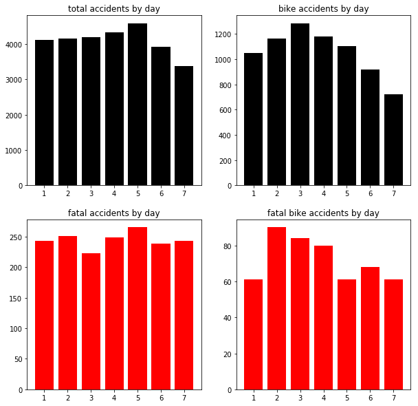 And finally, as a starting point for asking about which neighborhoods and times are the most dangerous for cyclists, I've taken advantage of the google maps API to plot all cyclist accidents (with motorists). This is represented by the heat map below. Overlayed on it are the 'severe injury' and fatal bike accidents. While this map is static, the python notebook is on my github to play with. Next time, I'll start to divide these accidents over time, and will ask whether there are zones in the city where the proportion of bike accidents that are fatal is higher than expected. 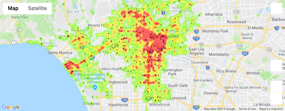 Comments are closed.
|
 RSS Feed
Proudly powered by Weebly